
A X I S - B R A N D I D E N T I T Y
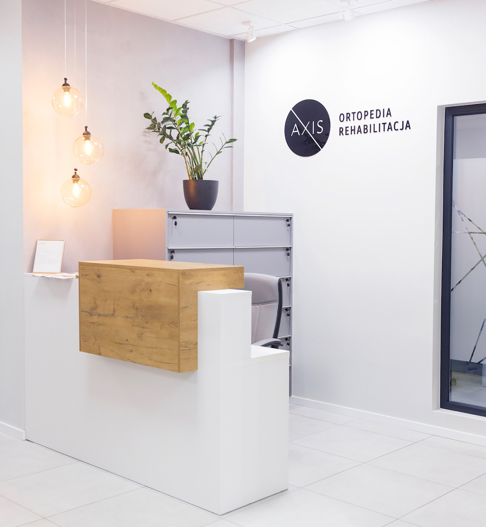
Axis Rehabilitation & Orthopedic Clinic was growing and expanding and needed re-branding. An opportunity emerged to create its visual brand identity. This unique collaboration, on top of the usual design work, provided a chance to assist with creating a new interior style. Through their visual brand, Axis wanted to reflect a high standard of medical services, the strength of their reputation, and create an atmosphere where patients feel respected and cared for.
Medical staff at Axis are genuinely dedicated to their profession, but to continue to provide the best physiotherapy services, they constantly up-skill. Progress, innovation, and proactivity are drivers of this brand's vision and mission. A modern and elegant style, industrial yet warm, fancy yet clean; these were examples of preferences Axis wanted to achieve with their new appearance.
M o o d B o a r d s
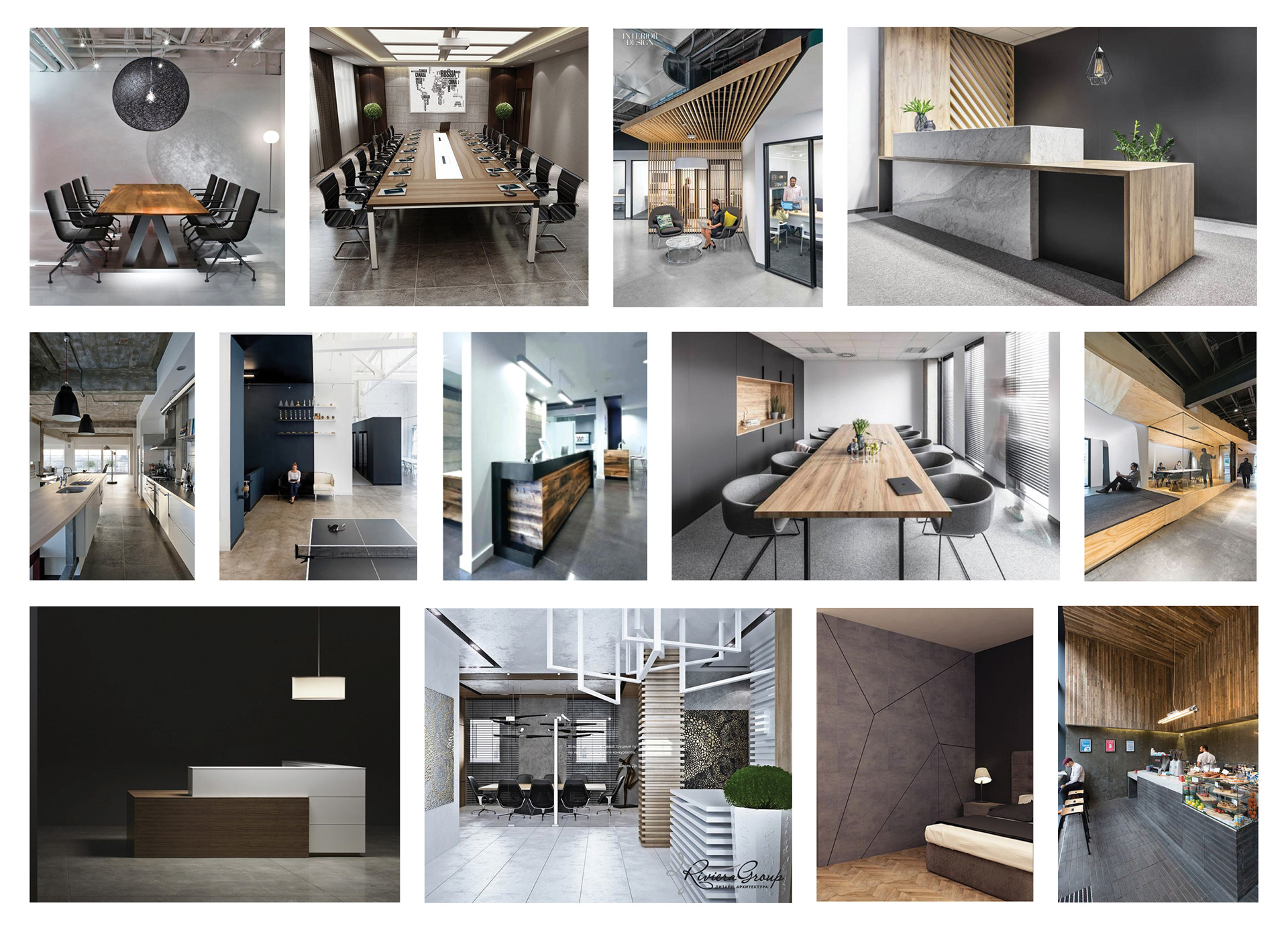
In most cases, I begin my design process by creating mood boards. They provide excellent insight into customers' vision, serve as a significant source of inspiration, and help establish a solid direction for the design style. I created three mood boards for Axis. First has a firm, industrial and modern style applied to office spaces: wooden elements, dominant greys, and charcoals, industrial feel yet cosy.
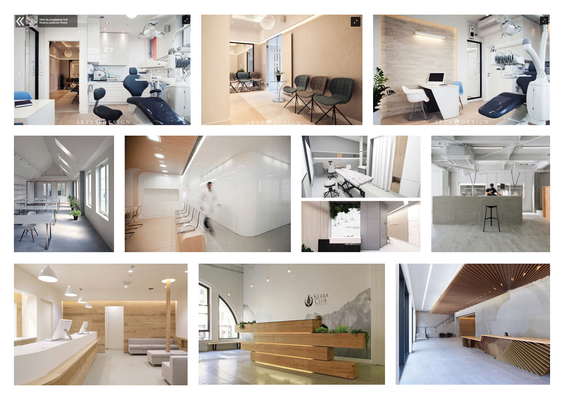
The second mood board represents a similar but much cleaner and significantly brighter style. Interestingly, such combinations are applied to salons and clinics, which is more appealing to Axis. Dominating bright colours: beiges and whites make it look fresh and energetic. This mood board greatly influenced the clinic’s interior style and my design process by adding more depth to Axis’s brand.
S k e t c h I n g
Another crucial step in the design process – sketching out the ideas. After initial research of the brand, it’s time for ideas generation. I reckon a computer will never replace the traditional form - pen and paper. Skipping this step may delay accessing the ideas that can be unlocked quickly with a simple sketch.
Another crucial step in the design process – sketching out the ideas. After initial research of the brand, it’s time for ideas generation. I reckon a computer will never replace the traditional form - pen and paper. Skipping this step may delay accessing the ideas that can be unlocked quickly with a simple sketch.

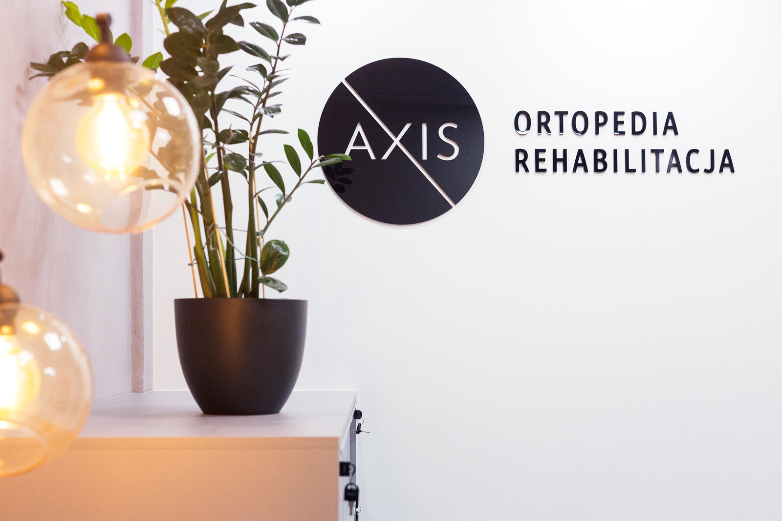
Axis' mission is to guide its patients back to moving freely. In anatomy, the axis is an element of the spine. Together with other components, it forms a joint connected to the skull and spine, allowing for various motions, e.g. head rotation. In astronomy, the axis is an invisible line around which objects revolve. In my final logo, I focused on the importance of motion and its graphical representation.
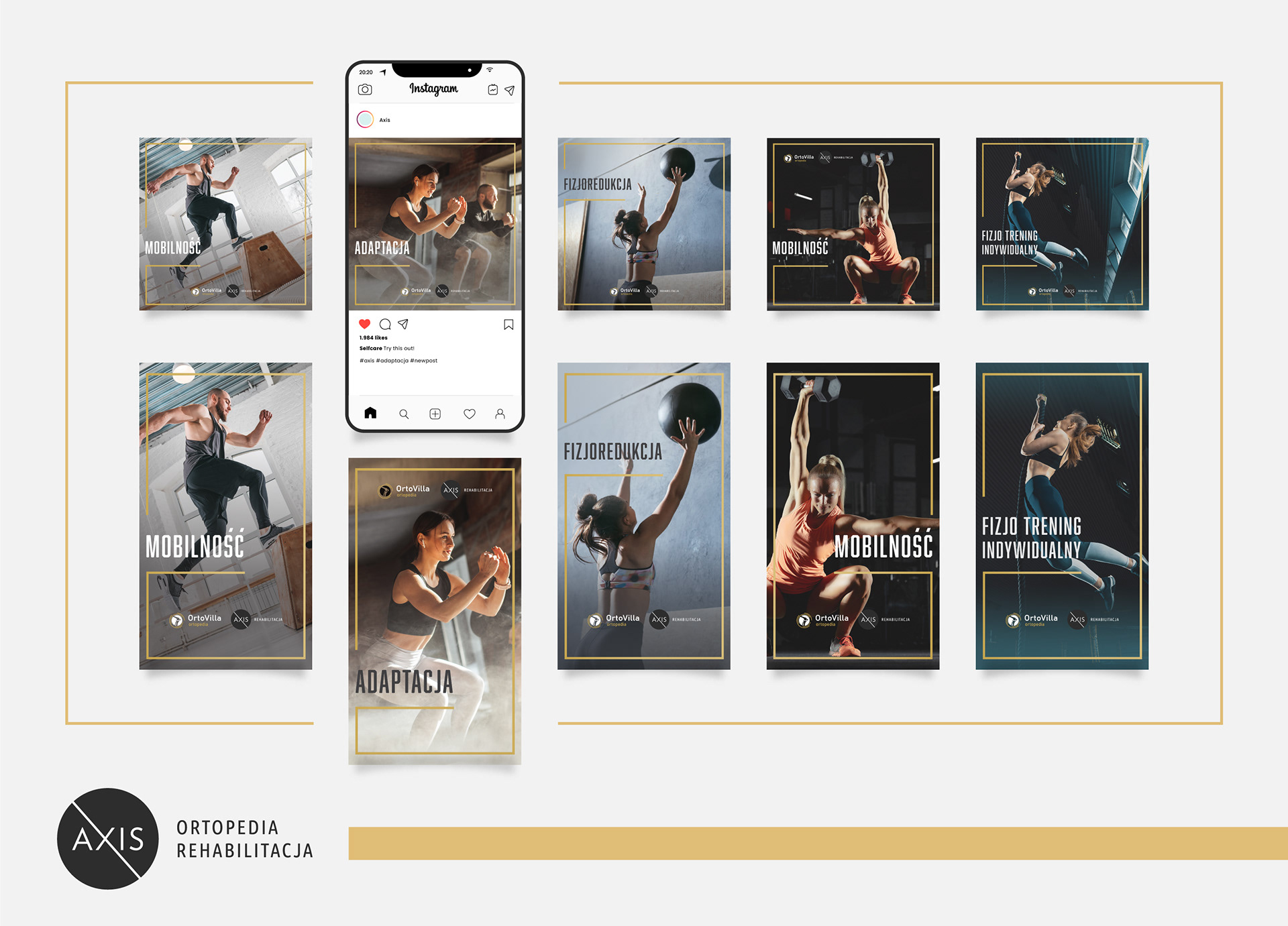
I N S T A C A M P A I G N
The newly opened and rebranded Axis Rehabilitation & Orthopedic Clinic became a success and generated a new business opportunity - the Rehabilitation Training Centre. The novel Axis Training Center offers one-to-one and group classes where participants will eliminate pain, improve mobility and motor skills and healthily lose weight.
Axis Clinic requested to come up with a set of Instagram ads to promote the training centre. We worked closely to accurately represent each class and the program through a selection of photographs. The chosen collection genuinely reflects what to expect, and with its modern look, specific mood and style, the target audience could engage with the brand more authentically.
Thank you!